Standards-based Score Analysis
2/21/2018
As our customers enter volumes of student mastery data into TeacherEase, we felt it was important to provide richer large-scale analysis tools. Good data analysis can help answer educationally-relevant questions and inform instructional decisions. Big data has transformed many industries and has similar potential in education. We think data analytics can help teachers and school systems make better decisions and be more responsive to learning.
Just a quick note, data analytics is *NOT* intended to replace teacher professionalism and judgement -- especially as applied to individual students. Educators who write free-text descriptions of student mastery can deliver thoughtful feedback, often more specific, subtle, and effective than score-based analysis.
The value of data analytics is at scale. Analysis of large data sets can yield insights to improve education. Computers can process volumes of information cheaply and quickly, giving educators access to better decision-making tools. With easy analysis, assessment data can regularly inform instruction, helping classrooms and school systems be more responsive to learning and student needs.
Since this is our first version of district-wide standards-based score analysis, we hope to get feedback from users and further enhance these capabilities. Feel free to let us know your thoughts.
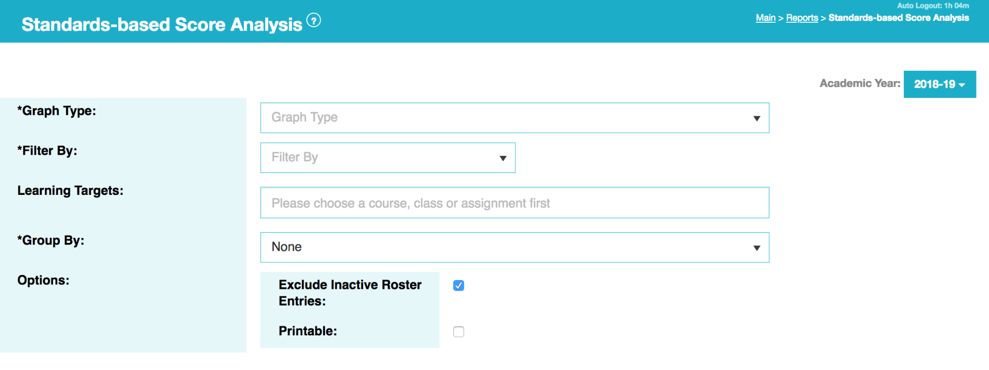
General Structure
The “options” page is pretty straightforward. You choose a graph type, population and filters (district, schools, courses, sections, and/or assessments), a set of learning targets, and whether you’d like data broken down into sub-groups (by gender, race/ethnicity, has IEP, low income, etc). The engine will analyze the data and generate graphs. Depending on the size of the data set, it may take a few seconds or minutes for results to appear.
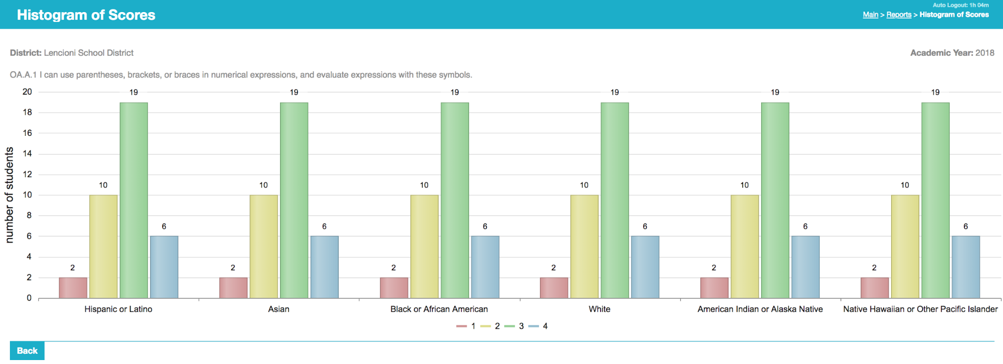
Histogram of Scores
The simplest graph type is a histogram, which shows the distribution of standards-based scores across a population.
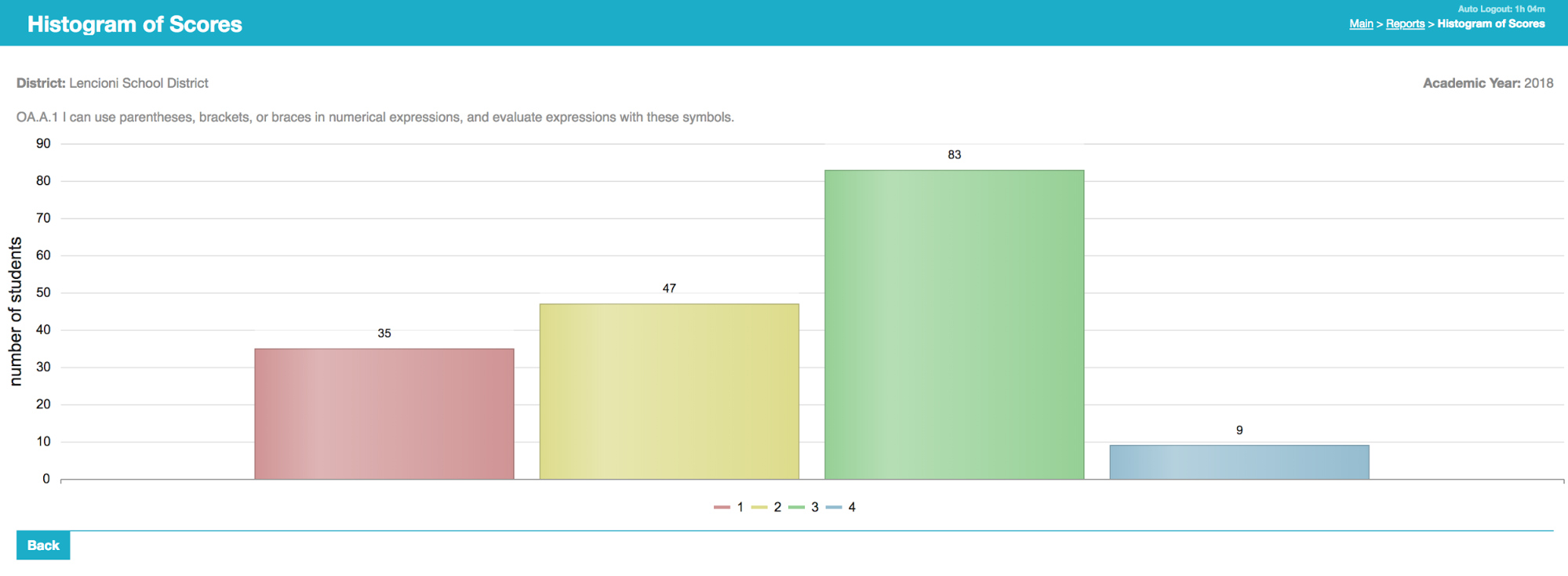
Examples below are a few good uses for the information. Most classroom-based analysis is possible without software, but is labor intensive. It’s much easier to click a button in TeacherEase, get results, and use them in the classroom.
- The histogram of scores for a section is good for planning instruction. You can decide whether to teach a large group lesson (if most students are at the same level), or break up the class into multiple instructional groups (if mastery levels are more diverse).
- If you teach a large group lesson, the data supports your choice of instructional complexity (introductory, intermediate, or advanced). While this is a pretty basic concept, it helps new SB teachers become accustomed to using data. They may discover that without data they were moving too fast (or slow) for the class.
- If you’ve already taught a topic several times, students’ skill levels likely have diverged. Analysis can identify a lower group that needs additional instructional support. Data analytics provide a foundation for a systematic approach to better serve these populations.
- Measure the size of the population at proficiency, to inform on pacing and moving on to later curricula.
- For larger populations (school- or district-wide), it can generate performance metrics at scale: students at mastery, students needing support, etc. There are a myriad of uses for this information.
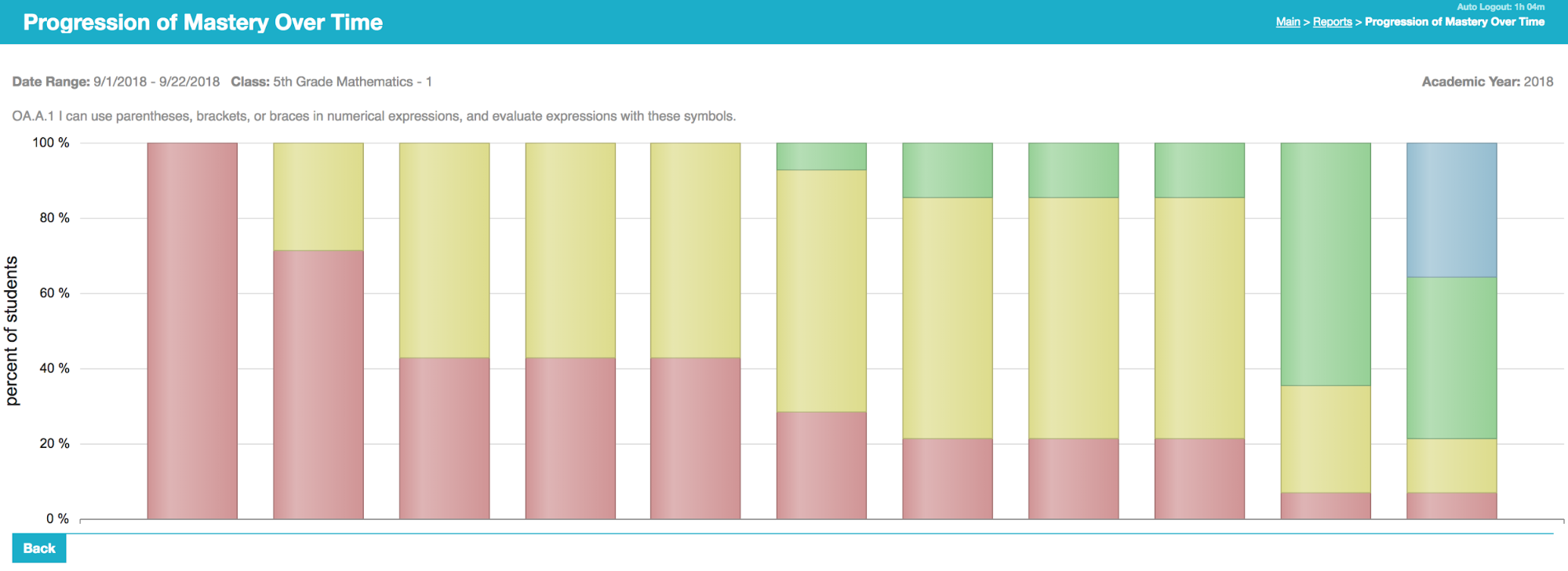
Histograms with Subgrouping
The next type of graph is to generate multiple histograms next to each other. This allows comparison of populations, which can be useful for many purposes. The example below shows histograms of scores for several sections (imagine that section 4 uses new-improved instructional techniques).
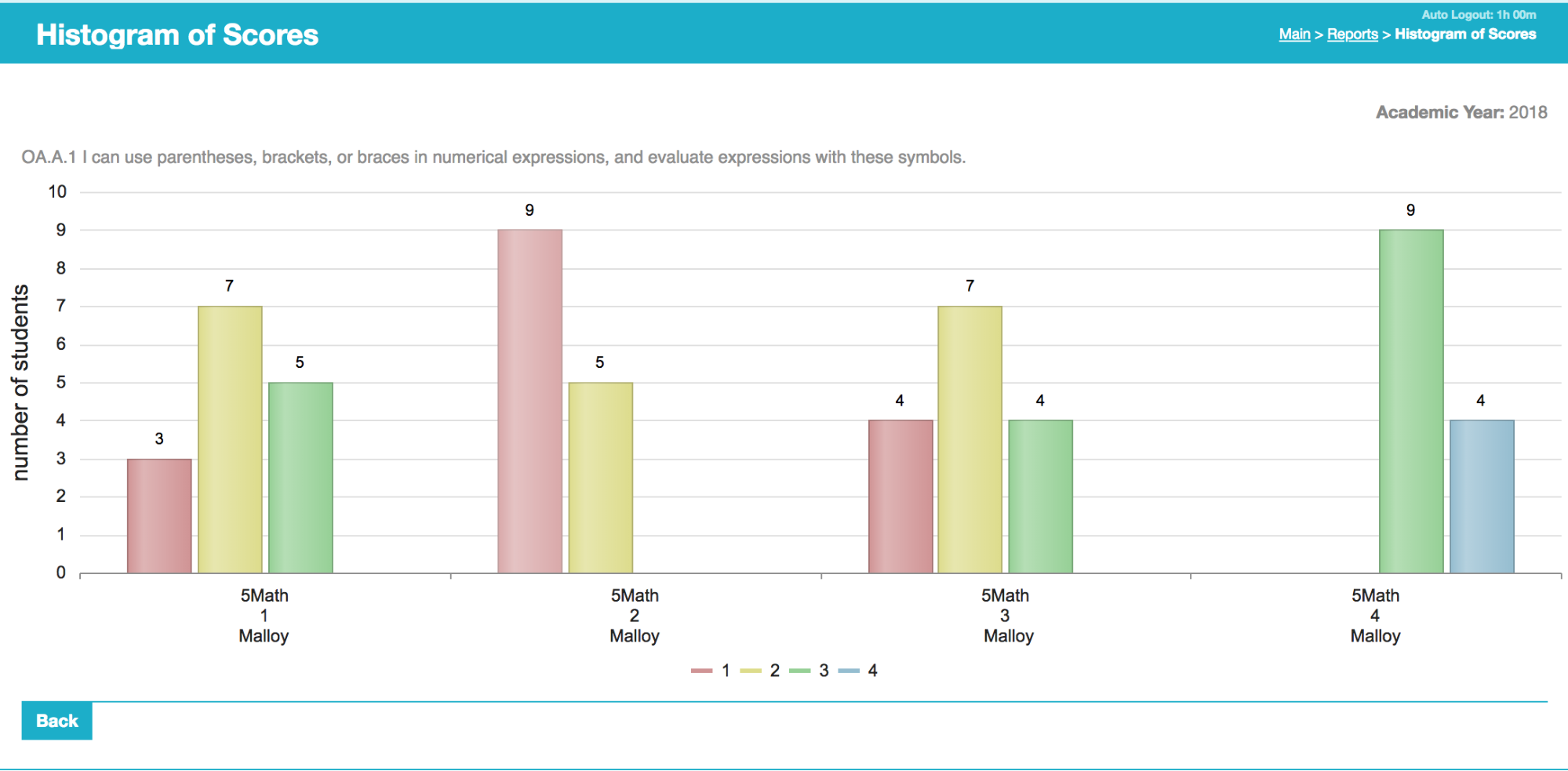
Comparisons can be used to evaluate the performance of new curriculum or instructional techniques. When adopting something new, it can be started as a small pilot, and resulting student mastery data can measure its effectiveness. This allows organizations to be systematic about innovation, get definitive results from new initiatives, reduce the cost of failure by starting on smaller populations, and consistently improve teaching practices.
Another use of comparisons is to identify great teaching techniques already inside the organization — to enable sharing of highly effective practices. The data will likely show groups of students that are learning more than their peers in certain targets. Those students’ teacher(s) can share their expertise (likely within a professional development setting), and help everyone to improve.
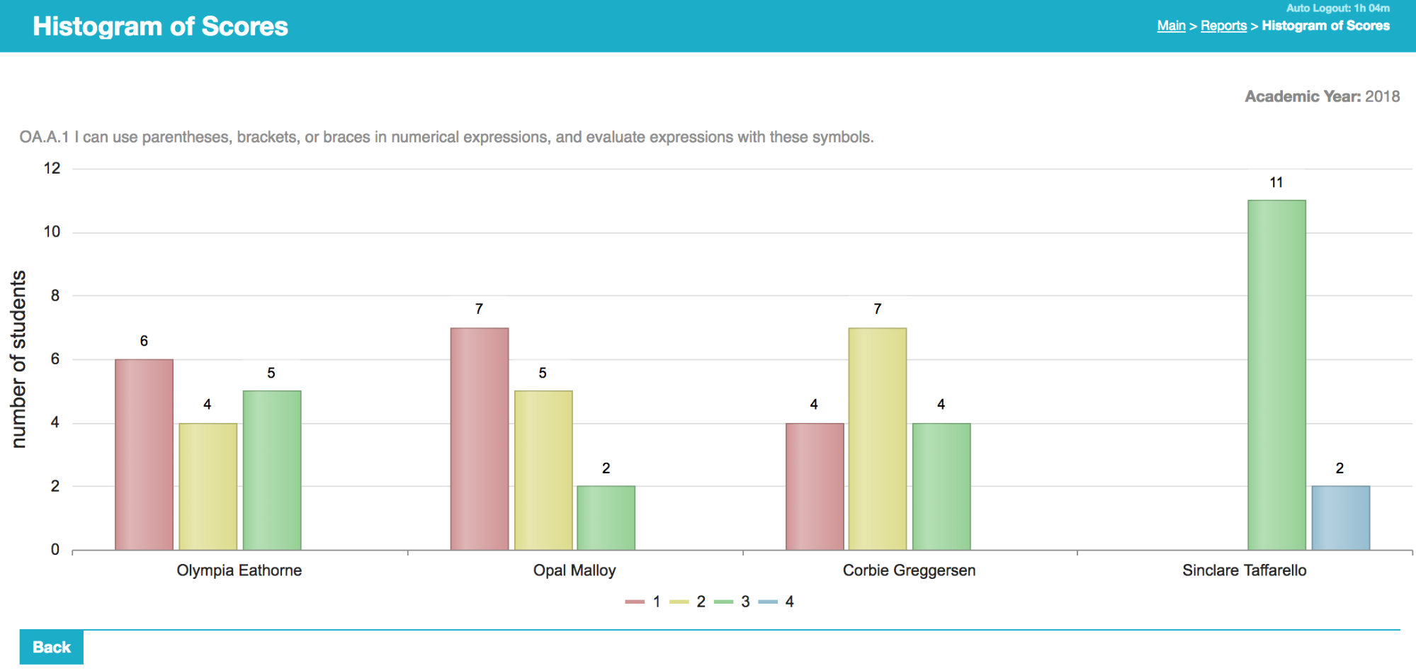
The analytics can also generate performance data by gender, racial/ethnic, IEP, low income, etc. It can break down by school, instructor, section, etc. There are likely many uses for this analysis.
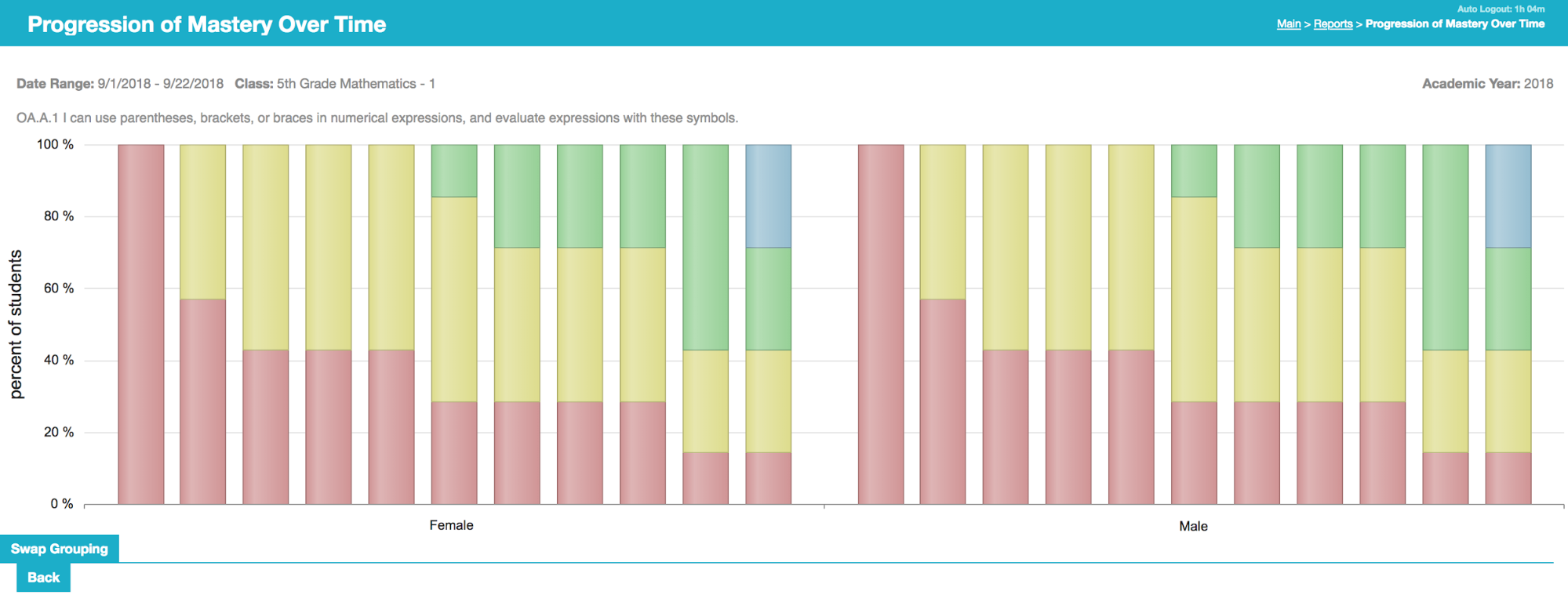
Mastery Progress Over Time
The next graph shows student learning over time. It shows a sequence of student score histograms, highlighting growth over time.
These graphs are useful for visually identifying student growth patterns. You can almost watch the class learn. It’s useful for understanding how long it takes for a population to reach mastery. This could be tracked longitudinally to compare learning rates.
One insight that's readily apparent are moments when students' scores jump higher. Depending on the frequency of data collection, it could identify lessons that are particularly effective at increasing mastery. It can also find periods of stagnation, when instructional time should be better used.
The granularity of analysis depends on the amount of data input to TeacherEase. If you only enter 3 common summative assessments per year, the progress graphs will be “lumpy.” If the organization builds common formatives too, there will be more data and a finer granularity of analysis. If teachers enter their individual progress checks or formative(practice) scores, the progress charts can approach real-time measurement of student learning (even if formative scores are not shared with parents and students to create a more positive learning environment).
This chart can also be run to compare subgroups, if desired.
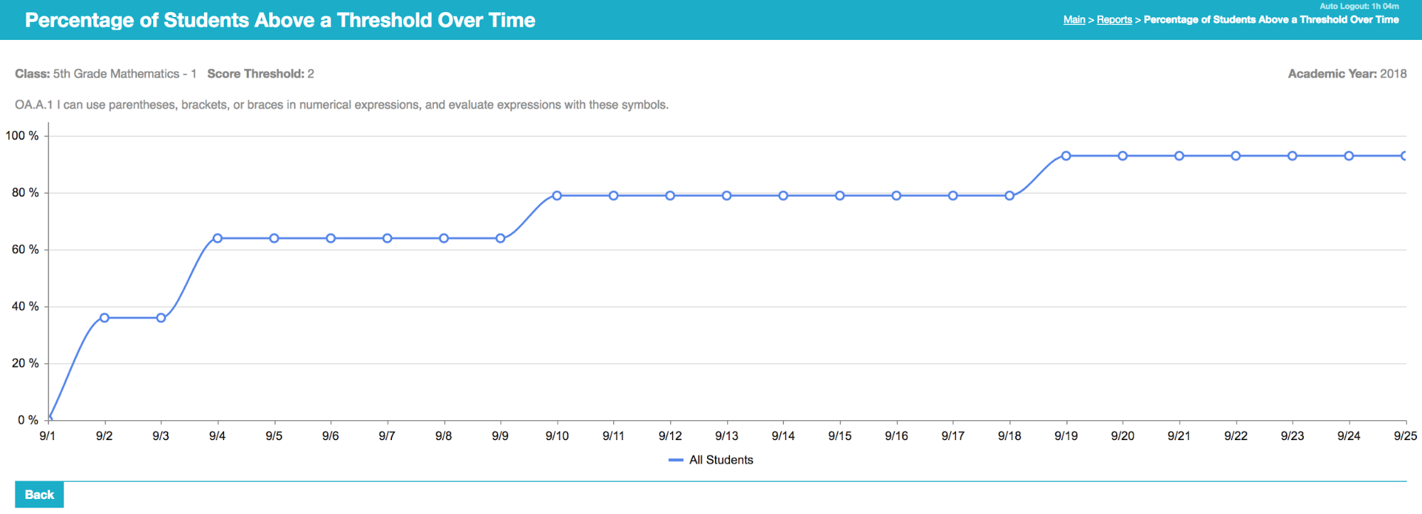
Students Reaching Threshold Over Time
The threshold chart is very similar to mastery progress over time, and shows essentially the same information in a different format. It sums up the percentage of students at or above a threshold. It’s good to measure the students at and above 3 (or 2, etc).
We hope that you enjoy our new functionality. Feel free to send us feedback, there’s a link at the top of every page.
The Common Goal Team